


커피창
Loyalty System
A local Korean café wanted to grow without going online. Customers were already asking for a rewards program. The constraint became the design brief.
The problem
Customers were already asking for something that didn't exist
커피창 is a cozy, minimalist café in Korea with a loyal but inconsistent customer base. The owner had a clear constraint — no digital presence, no social media, no online listings — for personal privacy reasons. That made traditional growth strategies off the table.
During my time observing the café, I noticed customers at the counter asking staff if there was any kind of points or rewards program. Competing cafés nearby offered them. Without one, there was no mechanism to turn occasional visitors into regulars.
Research
In-person observation and an owner conversation
I spent time at the café observing customer behavior and speaking directly with the owner. The research wasn't formal — but it didn't need to be. The signal was clear.
- 1Customers asked staff about loyalty rewards during their visit — unprompted, organically.
- 2Competing cafés in the area all offered some form of points or stamp system.
- 3The owner confirmed that repeat customers were the lifeblood of the business but there was no way to formally reward or track them.
- 4The owner's privacy constraint ruled out any app store listing, social media, or online presence — the solution had to work entirely in-person.
Key decisions
Designing within the constraint
The privacy constraint wasn't a limitation — it was the brief. Instead of building an app customers would download, I designed a system that lived entirely at the point of sale and in the customer's pocket.
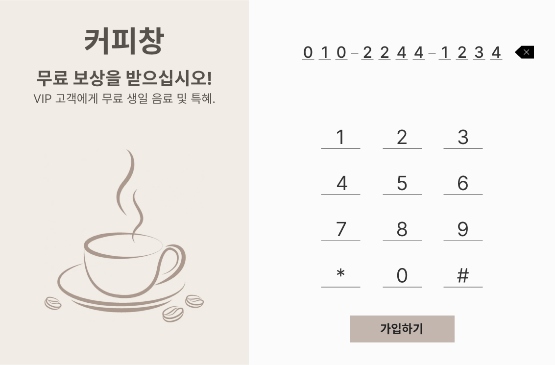
Digital — Tablet Interface
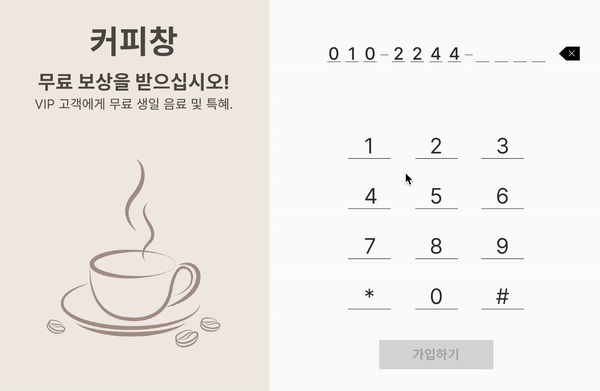
Redeem Points Flow

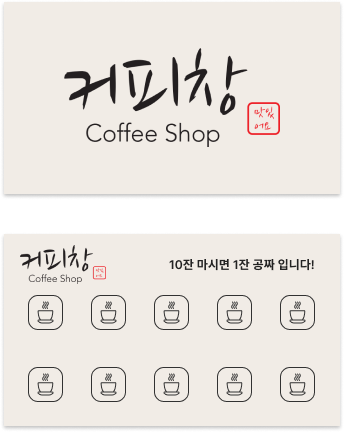
Physical stamp card — designed for customers less comfortable with technology
Visual design
Warm, minimal — matching the space itself
The café's interior is cozy and understated. The loyalty system needed to feel like it belonged there — not like a generic POS screen. The design language uses warm off-whites, muted browns, and clean typography that mirrors the café's physical aesthetic.

Competitive research — market analysis of loyalty program interfaces
Awareness
Getting the word out — without going online
Since digital marketing was off the table, physical signage became the primary awareness tool. Window displays and in-store signs communicated the café's hours, promotions, and loyalty program — creating a visual presence that attracted foot traffic without requiring an online listing.
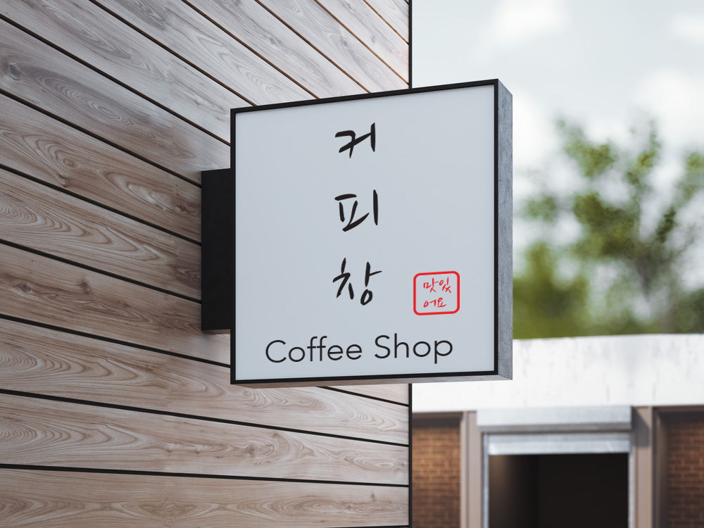

Physical signage — communicating hours, promotions, and the loyalty program without an online presence
Cultural consideration
Designing for the no-tip culture
In Korea, tipping is not customary — unlike Western café experiences. The interface was designed to return directly to the home screen after awarding points, removing any tip prompt entirely. This small detail respects local cultural norms and keeps the transaction feeling natural.

Flow returns to home screen after rewarding points — no tip prompt
Design system
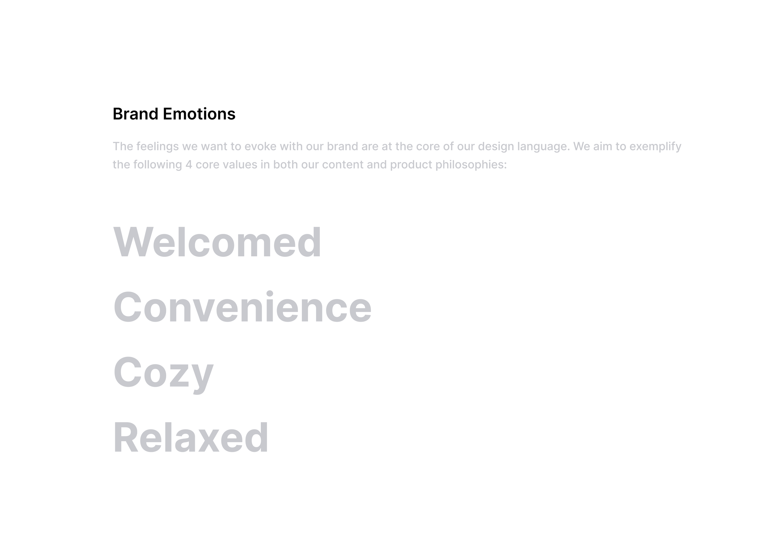
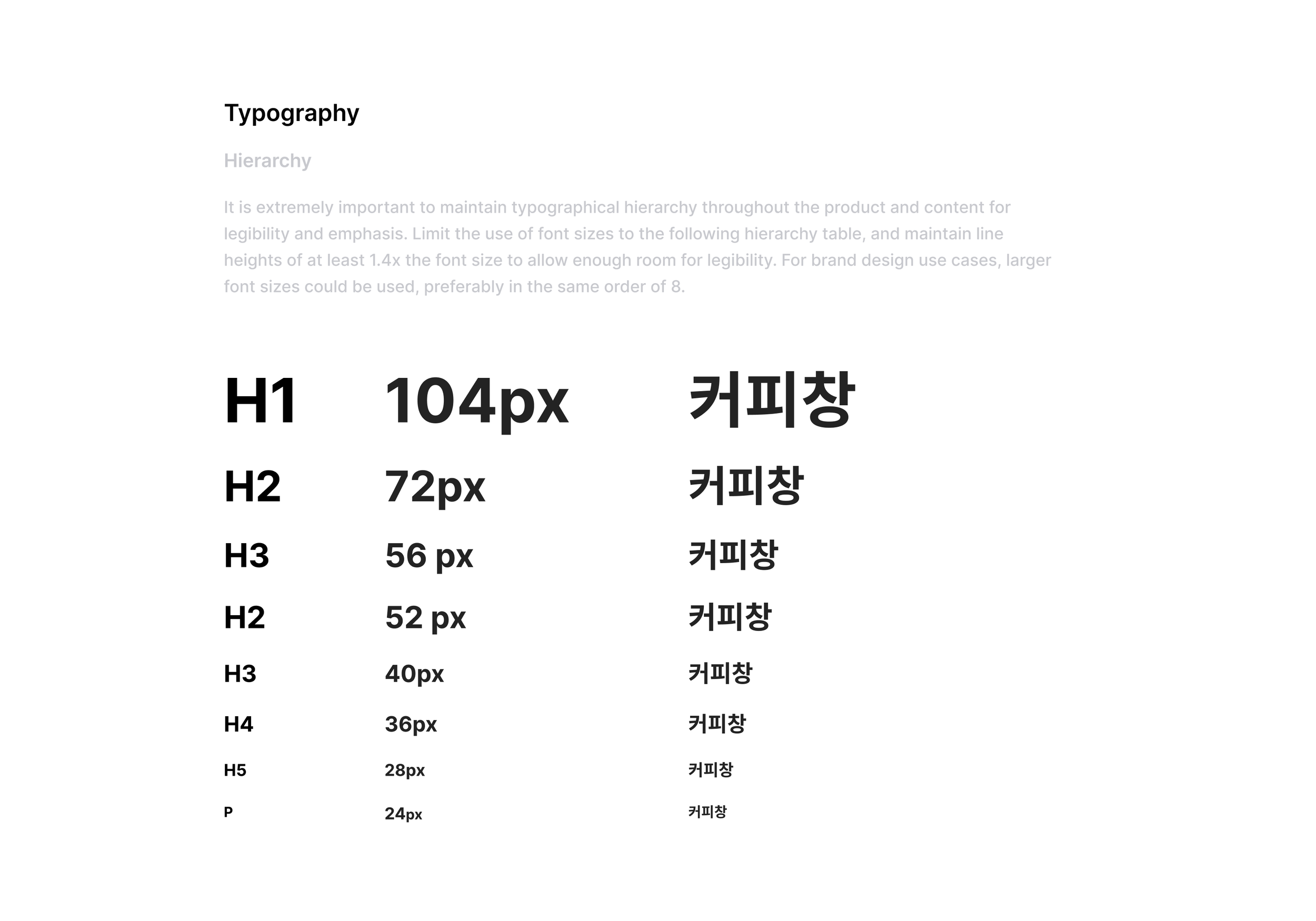
Colour, type, and brand emotions
The visual language was built around four design decisions: a warm cream palette drawn from the café's physical materials, soft brown accents that felt hand-picked rather than corporate, a single typeface used at two weights for clarity, and brand emotion words that kept the visual direction grounded throughout the project.


Brand system: warm cream palette, soft brown accents, minimal typography hierarchy
Outcome
Trial validated the concept
The loyalty system was piloted in a trial run with real customers. The project didn't reach full launch due to administrative factors outside the design scope — but the trial showed clear positive signals. The signage drove visible foot traffic, and customers who engaged with the points system returned more frequently during the trial period.
Reflection
What I learned
This project taught me that constraints are often where the most interesting design decisions happen. The owner's privacy requirement forced a solution that was actually more considerate of users — no app to download, no account to create, no data stored online. Sometimes the limitation is the design.
If I were to do this again, I would have structured the trial more formally — tracking metrics more rigorously and gathering direct customer feedback during the pilot period. The outcomes were positive, but having cleaner data would have made the case for full launch much stronger.