

Personal Trainer App
Schedule on Your Terms
A certificate course project built with real user research. The core insight — clients always adjust to trainers, never the other way around — became the design brief.
The problem
Clients always adjust to the trainer — never the other way around
Trainers advertise "flexible" hours — but those hours rarely align with when clients are actually available. This creates a friction point before the relationship even starts. Clients who can't find a trainer that fits their schedule simply don't commit.
Through research I found that the same problem existed across every competing app and service. None of them let the client's availability drive the match. That gap became the core design opportunity.
Research
Key questions that shaped the design
I used a goal-directed design approach — starting from the user's actual needs before touching any UI. Before designing anything, I asked:
- 1Do clients prefer working out during the day or at night? The answer shaped the scheduling system.
- 2Do trainers prefer video-based coaching or in-person sessions? This determined what trainer profiles needed to show.
- 3How much space and equipment does the client have? This became a filter in the preference flow.
- 4How much time can they commit per session? Short sessions vs. long sessions needed to surface different trainer types.
Competitor analysis
Every competitor had the same blind spot
After researching existing apps and gym services, one pattern was consistent across all of them — the trainer's schedule was fixed, and the client had to fit around it. No platform let the client's availability drive the match.
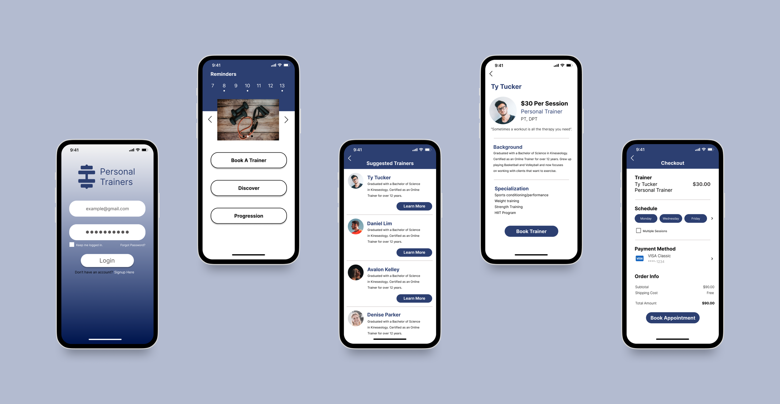
Process
Starting with wireframes before any visual design
I started with a low-fidelity wireframe to map the core user flow — how a new client would search for, filter, and book a trainer based on their preferences. Getting the flow right before adding any visual polish helped avoid designing around the wrong structure.
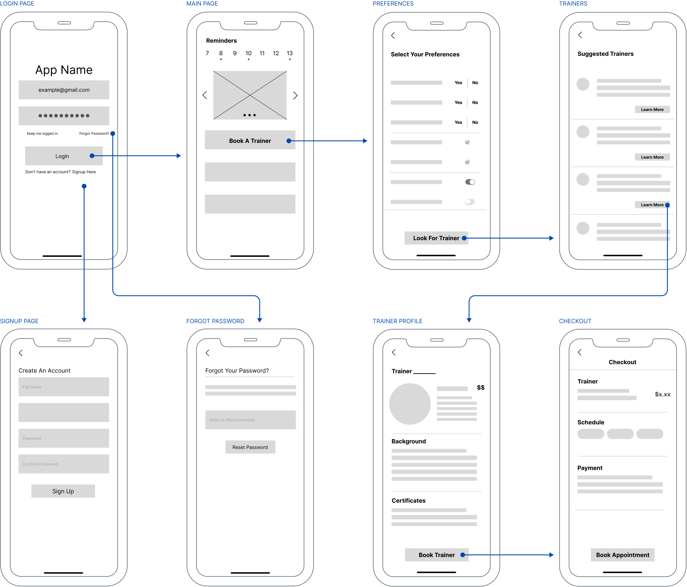
Initial wireframe — core user flow from onboarding through trainer selection and booking
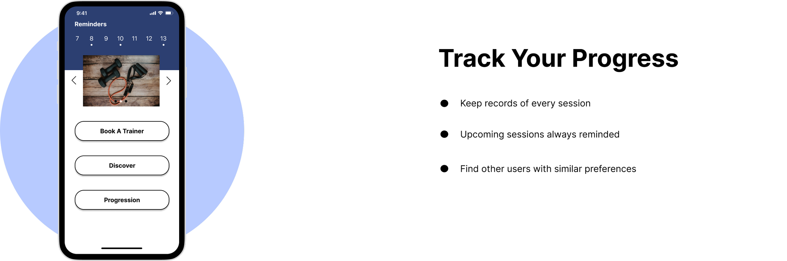
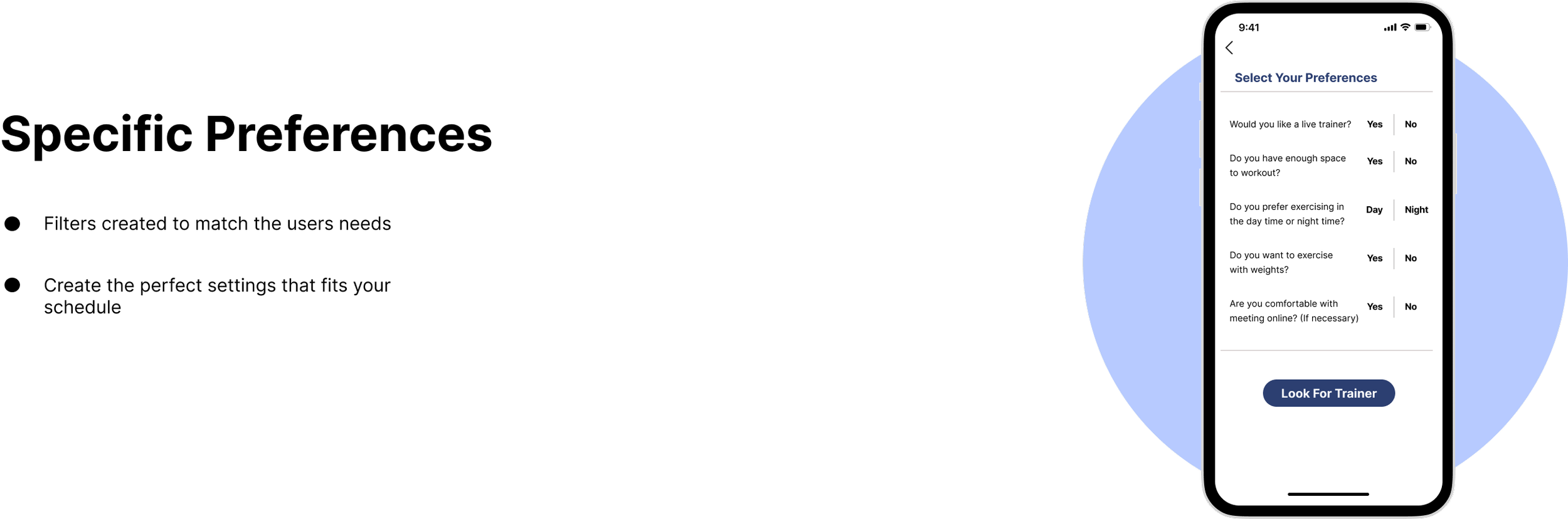
Early designs
First pass — three core screens
The first round of designs focused on three key moments in the user journey — tracking progress, setting preferences, and finding matched trainers. These screens were then tested with real participants.
Track Progress
Set Preferences
Matched Trainers
Usability testing
Four participants, three clear improvements
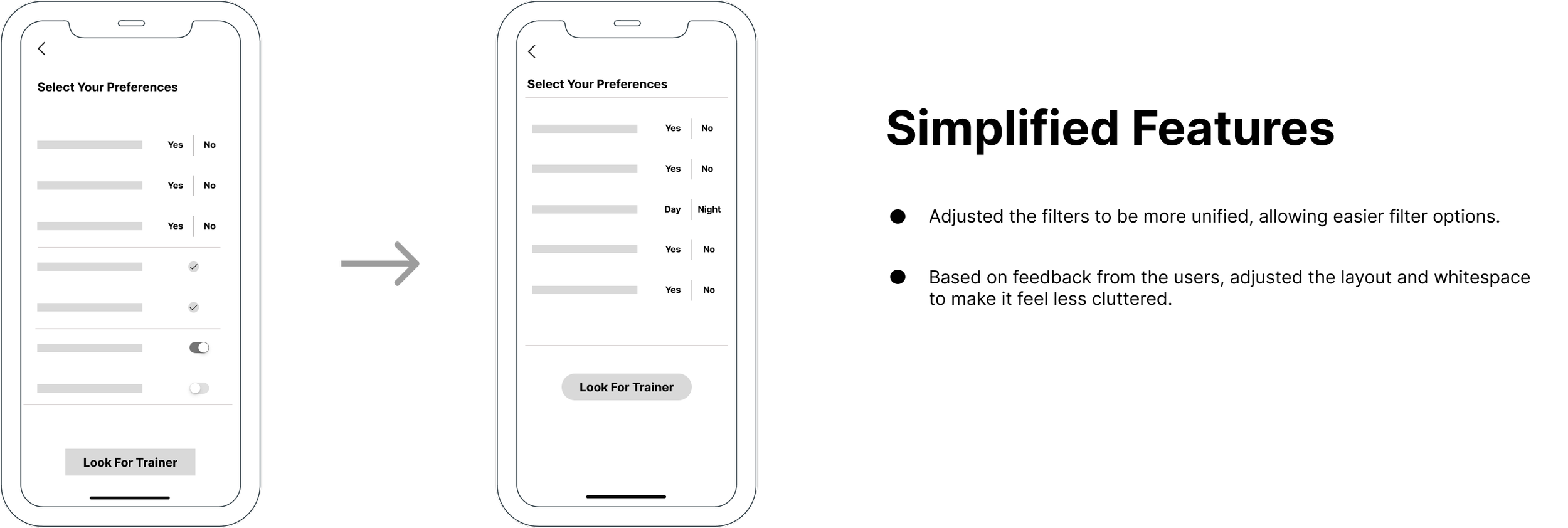
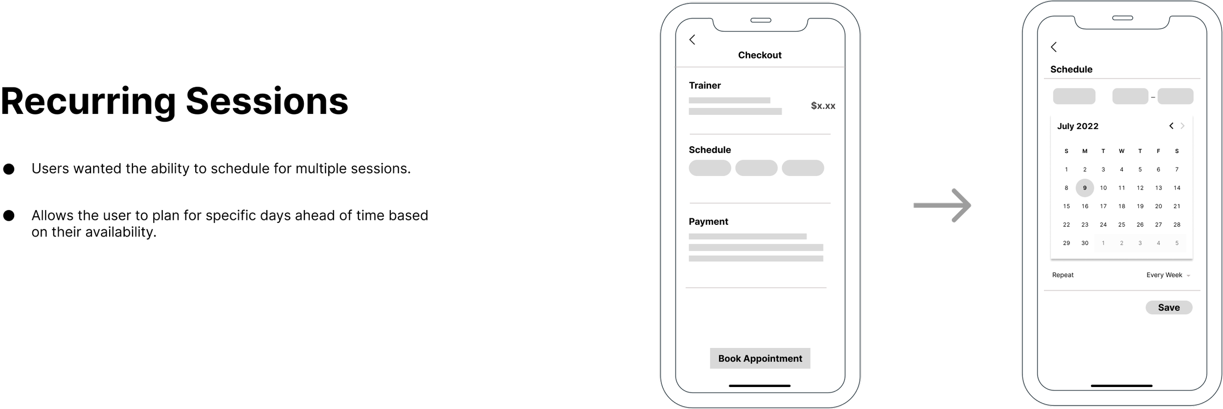
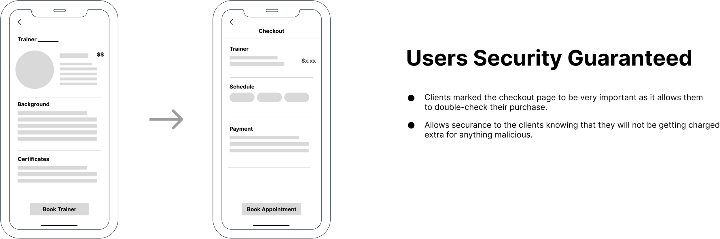
I conducted usability testing with four real participants and gathered feedback on the user flow. Three specific improvements emerged that made the experience meaningfully better.
Simplified Features
Recurring Sessions
Security
- 1Simplified features — participants found the initial feature set overwhelming. I stripped back non-essential options to keep the onboarding focused on the core job: finding the right trainer.
- 2Recurring sessions — participants wanted to book multiple sessions at once rather than rebooking each time. Adding recurring session support reduced friction for committed users.
- 3Security reassurance — participants expressed concern about sharing personal fitness data. Adding explicit security messaging at key moments increased trust in the platform.
Final design
Preference matching and flexible scheduling
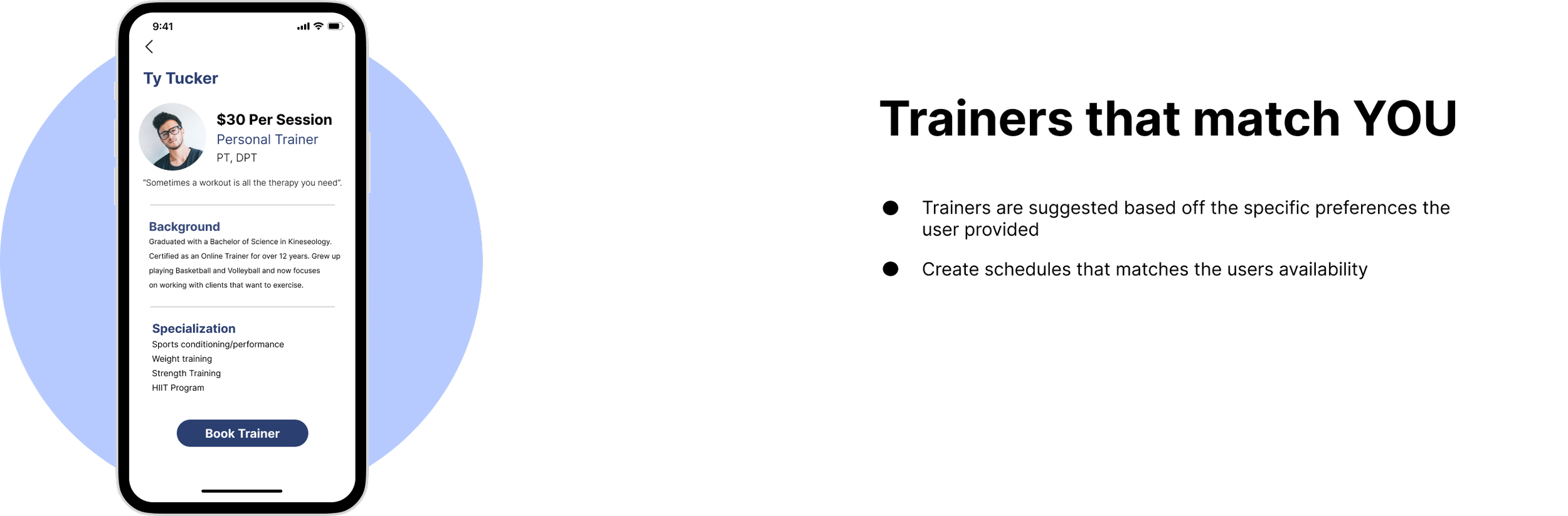
The final prototype addressed all three usability findings. Preferences now drive the entire trainer matching flow, multiple sessions can be booked at once, and the experience feels streamlined rather than overwhelming.
Preference Matching
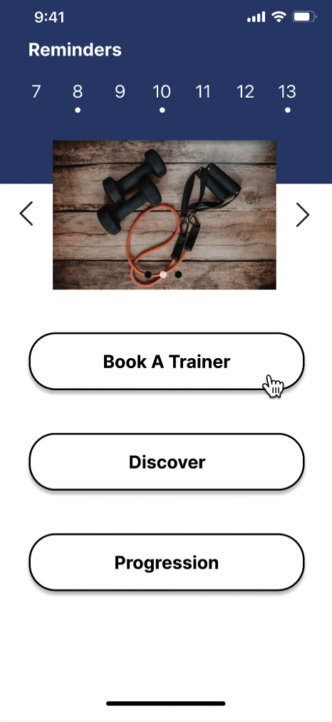
Multiple Bookings
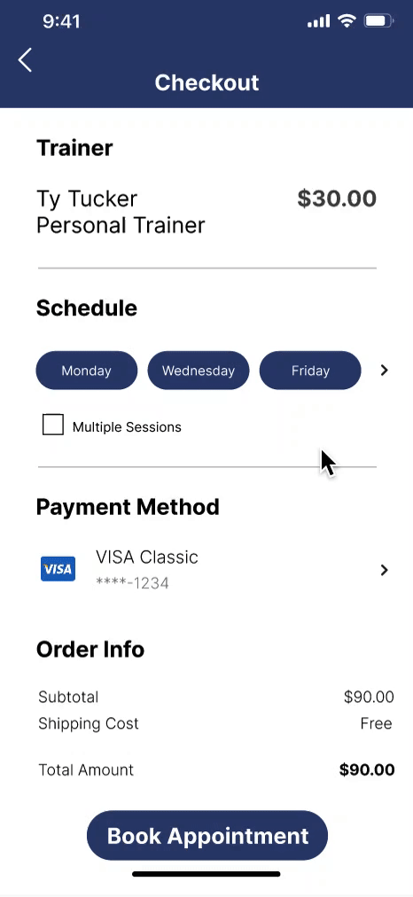
Left: preference flow surfaces the most compatible trainers. Right: multiple sessions can be booked in a single interaction.
Design system
Built for energy and clarity
The visual language needed to feel motivating without being aggressive. Dark navy gives the app a premium, focused feel while the bright accent blue keeps it energetic and modern.


Outcome
Design decisions grounded in real research benchmarks
This was a certificate course project — the app was not shipped to market. The projected outcomes below are based on published fitness industry research, including data from Redbook Health & Fitness on the impact of trainer availability on client goal achievement. They were used to frame and validate the design direction, not measured post-launch.
Reflection
What I learned
More iterations are never wasted. Early in the project I worried I was designing too many mockups — but when it came time to match designs to the user flow, having a large library of options meant I could combine the best parts of multiple directions rather than being locked into one.
Feedback is the work. The usability test was where the real design happened — not the wireframes, not the visual polish. The three changes I made after testing (simplified features, recurring sessions, security reassurance) made the app meaningfully better in ways I wouldn't have found on my own.